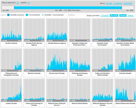
Expense visualizer (via FlowingData blog)
In an effort to make Canadian government expense data more accessible, FFunction designed the Expense Visualizer. A slider on top lets you filter by time, and small graphs show spending by different departments. Rearrange panels as you wish, and select among several scaling options as absolute values or relative. Bookmark your custom views or send them to others.
It took two years to make, but I'm pretty sure most of that time was waiting for all the groups to publish their data since the implementation itself is fairly straightforward.
A vertical axis probably would've been useful to see the values more easily. Or even better, a display of values as you rollover the graphs (like this).
[Thanks, Sébastien]
- US Demographics Visualizer Using Virtual Earth
- Inaugural Words From 1789 to Present
- Diagrams Galore in Diagram Diaries Flickr Group


